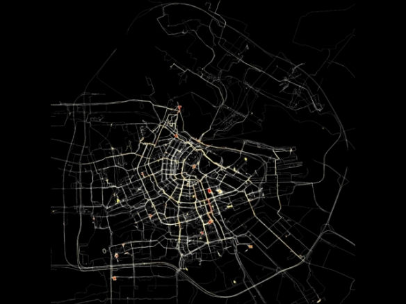
cc. Waag Society/Esther Polak 2002
This is the third of the Living Maps 2014 seminar series, and the second I have been able to attend. It was held on March 11th at the Geography Building at Queen Mary University in East London (which has the unique situation of having a Jewish cemetery right in the middle of the campus).
Consisting of another three lectures, it dealt primarily with the issues of power, and the use of cartography as a way of imposing control over landscapes, and the use of counter-mapping to oppose this.
The seminar started with a talk from Øyvind Eide, a senior analyst at the Unit for Digital Documentation, University of Oslo. His talk, ‘Sand in the map making machinery’ looked at the problems of illustrating a landscape on a 2D map from a theoretical perspective. This follows on a bit from the talks that were given at the previous seminar which looked at how the map on its own was inadequate for the task of recording and presenting local knowledge and memories. Øyvind quoted a Sami poet and dramatist, and former reindeer herder, Rawnda Carita Eira who said “How could something as complex as the natural world be expressed as a two dimensional map?” The answer was, as expected, that it can’t. At least not on its own, but there is also the problem of what Øyvind called the ‘syntactic difference between the visual and the textual’ and it is this that is his ‘inherent’ sand in the map making machinery. Simply put, the textual and the visual will always convey different information about a place or landscape. On its own a textual description will suffer from vagueness, unspecification and disjunction in which the text will not match the point references of an actual map. Without the a topographical map, the text is easily taken out of context. This is because maps are reflexive – the points on a map are in relation to each other. A is to B what B is to A. Language and description on the other hand does not have the constraint of reflexivity.
Øyvind used a number of examples to illustrate the differences including a 1995 absurd and surreal novel by Kazuo Ishiguro called The Unconsoled in which a man is taken on a journey from one point to another but which turn out to be the same place (a non-geometrical landscape). He also used the example of Peter Schnitler, who in the 1840s was commissioned by the Danish King to map the Scandinavian borders, an area inhabited by semi-nomadic herders, and with little notion of an un-dynamic, permanent border. To understand the landscape Schnitler had to interview farmers who’s farms and neighbouring farms were constantly shifting. Hybridity becomes the key to successful geocommunication, in other words, in much the same way as GPS does today. Texts, maps and other medias produce different images of the world, and the two of them can play together.
The second talk was given by David Pinder, a Reader in Social and Cultural Geography at the Queen Mary, University of London. Entitled ‘Map and be mapped’ it took a critical look at the use of cartography by those in power, the political motivations behind maps and the use of cartography in societies of control. He also looked at the various ways in which artists, cultural practitioners and activists try to intervene in the politics of space. Maps and the practice of mapping have long been tied to powerful interests, state power, imperialism and property ownership. Pinder started with examples of where maps have been used in military circumstances, first citing the Cuban-American artist, writer and feminist Coco Fusco who noted at the time of the Iraq War that the news frequently involved “men in uniforms pointing to, or better yet, walking across maps of the Middle East”, and the Marxist geographer Neil Smith who described the first Gulf War as the first full-scale GIS war. The assertion here is that the map, and the act of mapping can act to de-humanise and abstract real people in real places, and has therefore contributed to warfare, imperialism, conquest and control.
Pinder went on to look at examples of mapping as a means of countering top down control but before doing so cautions against a complacency in critiquing examples of counter-mapping. The greater use of new technologies, for example, needs to be thought about in terms of a context of globalisation and an intensifying digital divide in terms of access. Of no less importance is the very large issue of marginalisation. The encouraged participation of one part of a community may still exclude another, some may even be deliberately excluded (David Sibley has been one of the best at highlighting this with his book Geographies of Exclusion). What are the terms of participation? And how are local voices incorporated? “Mapping”, Pinder says, “counter or otherwise, is done under conditions not of ones choosing, in a world that is already thoroughly mapped.” Furthermore, the inter-relations of places (Doreen Massey again) seems, in my opinion, to be another inherent sand in the map making machinery.
The projects that David Pinder did use to illustrate counter-mapping have, importantly, been designed to stimulate critical thinking through symbolic challenge and disruption and have been constructed from within the systems that they wish to disturb. He gave the examples of
- Amsterdam Real Time which asked 60 voluntary participants to carry a GPS with them for 2 months, producing a map which is constituted out of the every day movements of the participants (the map at the top of this post). Its purpose was to show how people moved through and used the urban space.
- Catherine D’Ignazio, who goes under the artist-alias of Kanarinka, created a project called ‘It takes 154,000 breaths to evacuate Boston‘. In it Kanarinka ran the entire Boston emergency evacuation system (installed in 2006) as an attempt to measure the distance in human breaths. It was an attempt at answering the question of how you measure fear in a society obsessed with security and preparedness.
- Paula Levine, a Canadian-American media artist and professor of art at San Francisco State University, created a project called ‘Shadows from another space: San Francisco-Baghdad, 2004‘ which mapped the missile and bomb sites in Baghdad, Iraq from the US invasion in 2003 upon San Francisco, with each site documented with photographs, maps and GPS coordinates, “the same technology used by the military to target original sites in Baghdad”. The opposition to the dehumanising effects of military maps was further illustrated by a small cannister left at each site which contained the names of all US military personnel who died in the invasion, and how they died.
- Electronics Disturbance Theatre, a collective of cyber activists, critical theorists and performance artists who campaign for electronic civil disobedience, created the Transborder Immigrant Tool. It uses the GPS systems that the border police use to monitor migrant movement in order to evade the border police and help migrants find the best routes across as well as find water points. The Transborder Immigrant Tool has not simply been a tool to challenge the systems of authority in the US but a case of re-appropriating technology for the sake of life and death decisions.
- Finally, Pinder gave the example of Hasan Elahi who is currently Associate Professor of Art at the University of Maryland as well as its Director of Digital Cultures and Creativity. Elahi is an interdisciplinary artist who examines issues of surveillance, citizenship, migration, transport, borders and frontiers. His main project was started in response to an incident that occured at Detroit Airport on 19 July 2002. Elahi, who is Bangladeshi born, was detained and interrogated about his movements, during which the FBI (who had mistakenly added his name to the US governments watch list) requested that he log his movements with them. Elahi decided to do that and much more, and started to log his every activity by recording and photographing where he ate, slept, went to the toilet, travelled to etc. His work is the result of his resolve to both pre-empt further problems, whilst raising questions on personal privacy and the selected targeting of individuals by the security services. (watch his TED talk here. It’s excellent!!).
Continuing on the theme of counter-mapping, the final talk came from Iain Boal, a social historian of the commons. Iain Boal is part of a collective of historians, writers, teachers, artists and activists called the Retort Group which had instigated a project called West of Eden. Its purpose is to catalogue and map an ethnography of commons and communal enterprise in the San Francisco Bay area in response to their largely being written out of history and the visual representation of the West today. Today America is characterised by a classical liberal almost-obsession with private property and the contemporary idea of communes is often linked to failure and eventual criminality. But California and the San Francisco Bay area has a history of communards and utopian missions and colonies, and as the ‘wrestling Anglos’s punched their way into the West’ they first declared the land as public. The contrast between todays views on property and the views of the western pioneers was illustrated by Boal with the example of shipyard waste material which at the time was left for whoever needed it. It was not theft but a commons. Boal states that the story of modernity, by contrast, is the ‘construction of scarcity’.
The West of Eden project was not an example of counter-mapping as described by Pindar who used examples of where new technologies have been re-appropriated, but instead an attempt to re-insert and remember a way of life that is anathema to the modern construction of what America is today. The mapping of the utopian missions and communes, at first glance reinforced the idea of their non-permanence until you investigate deeper to discover just how long many of them lasted for, and the various reasons for their eventual failure. Criminality was most often not the end result. Intense poverty often was, however. Their eventual failure was occasionally the result of a lack of carrying capacity where they became too big for the space they occupied, such as the Morning Star Ranch which was founded in the 1960s. The main reason, however, was their eventual eviction by the state authorities. Boal notes that what typically happened when a commune was set up was that the authorities would try and come after it, usually using planning codes as a legal means with which to do so. One particularly interesting example Boal gave was of the Native American occupation of Alcatraz which lasted for 19 months from November 1969 to June 1971 which towards the end dwindled in population due to a kind of dilution of its original purpose but was eventually forcibly removed after having been essentially embargoed by the State.
It would be immensely difficult, if not a little daft, to say that criminality and the cult-of-the-leader were evils that did not occur. They almost certainly did. Yet Boal argues that in many cases the problems laid with a particular tragedy of the commons. But rather than the tragedy that Garret Hardin wrote about in his essay of the same name, it was an altogether different tragedy. Garret Hardin highlighted how in a grazing commons, there is an incentive for a farmer to over graze as the benefits accrue to him, but the costs are born by all. In the communes in California, however, the tragedy was that however many times a commune was attempted, there was always someone with enough power to shut it down.

The second project that Iain Boal mentioned was the May Day Rooms, located in London’s Fleet Street. Like the West of Eden project, it was set up as a means to archive examples of social, cultural and political dissent and describes itself as a “safe house for vulnerable archives and historical material linked to social movements, experimental culture and marginalised figures and groups”. And like the West of Eden project, it aims to reinsert what often becomes a forgotten history. (The May Day Rooms website can be found here).
While Øyvind Eide started by looking at the problem of contextualisation of a map vis-a-vis visual and textual representations, David Pinder and Iain Boal took this further to show how maps have been re-appropriated in order to add context to space and the people who have inhabited it. Pindar gave examples of how the technologies that governments use have been used to challenge policy. Boal showed how the history of dissent has largely been removed from official information and maps, and gave examples of projects which have sought to safeguard that history. What all have shown, however, and what the themes of the seminars so far have shown, is that mapping and GIS are useful tools, but on their own do not allow for the full diversity of human experience. The seminars have not been seeking specifically to provide answers but instead to bring to the fore debates on contested issues, encouraging you to think critically on the motivations behind a map and to think about the particularly important issues of marginalisation, exclusion, surveillance and the attempts by authorities to create public order and a conforming public.
*The Living Maps seminars is a series of seminars and lectures, running one Tuesday a month which explores new directions in critical cartography. The next seminar is at the UEL Docklands Campus on May 13, 6-8.30pm, titled ‘Marginalised Bodies, Liminal Spaces’ which looks at issues of disability and the fight for access to the city.
*Links on the speakers:
http://www.kcl.ac.uk/artshums/depts/ddh/people/students/eide/index.aspx
http://www.geog.qmul.ac.uk/staff/pinderd.html
http://www.pmpress.org/content/article.php?story=IainBoal